Lab 4 - Responsive
Goals of the exercise
- Create a responsive web page using a mobile-first approach
- Apply CSS media queries correctly
- Use responsive images that adapt to screen size
- Make layout elements scale fluidly with the browser window
- Apply correct typography rules for readability
- Style links and buttons with proper color contrast and accessibility
- Practice structuring and documenting work in a portfolio
 Go to the solution
Description
In this exercise, you create a responsive website using HTML and CSS. Starting from given files, you apply a mobile-first approach and use media queries, fluid layouts, and responsive images to adapt the site to different screen sizes. You also improve typography and style links and buttons with proper contrast and accessibility, and document the work in your portfolio.
Related links
Reflection
-
Waaw!
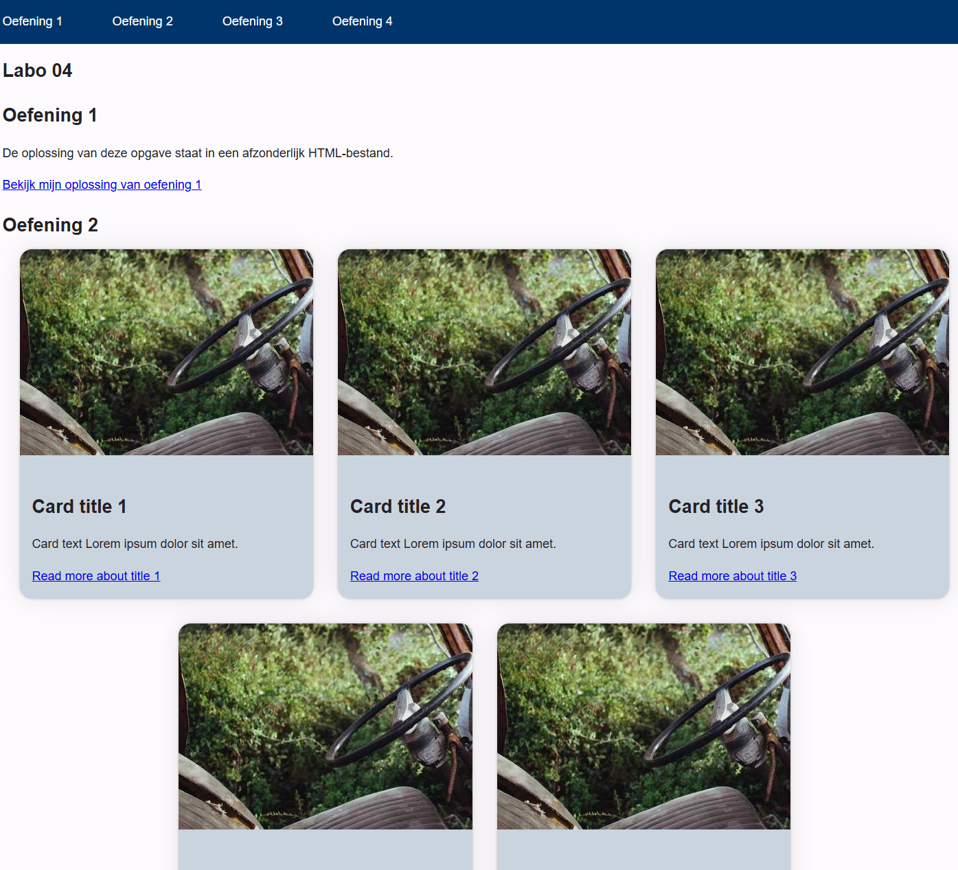
The cards, images, and typography were implemented correctly and the layout worked on all screen sizes.
-
Aauuw!
Responsive and adapting correctly to different screen sizes using media queries and fluid layouts.
-
Not sure?
The CSS could be more organized, accessibility could be improved, and more testing on different devices would help catch small issues.